Developed a systematic visual language for global editorial content, utilizing color logic and images, and icons to create a scalable, premium brand identity that streamlined production for the marketing team.
To transform a high-volume content channel from a series of fragmented, one-off designs into a cohesive visual ecosystem. The primary objectives were to:
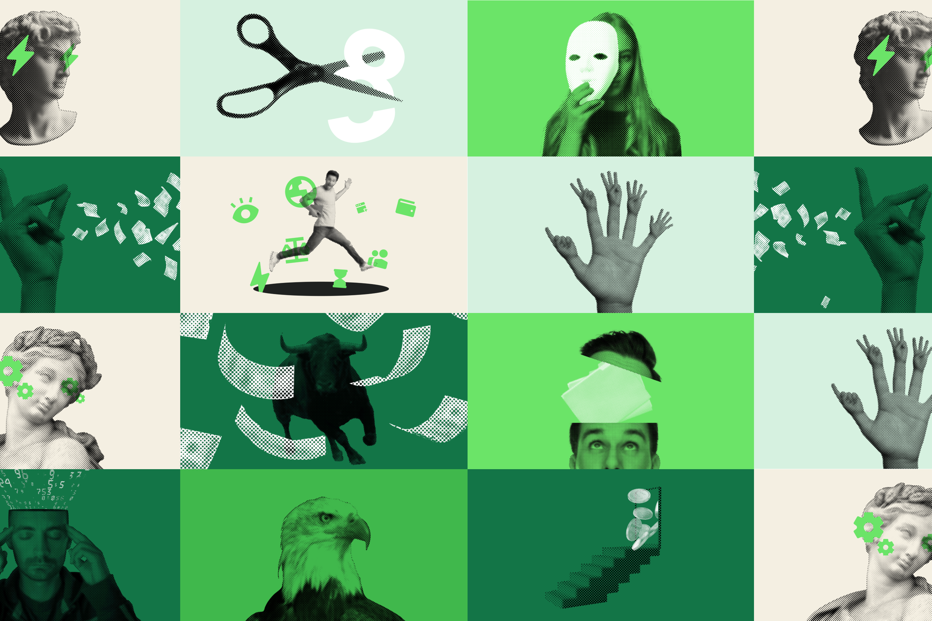
Content FragmentationWith a high volume of articles being published across various topics, the blog was losing its visual cohesion. The marketing team needed a way to produce professional, on-brand covers quickly without starting from scratch for every post.
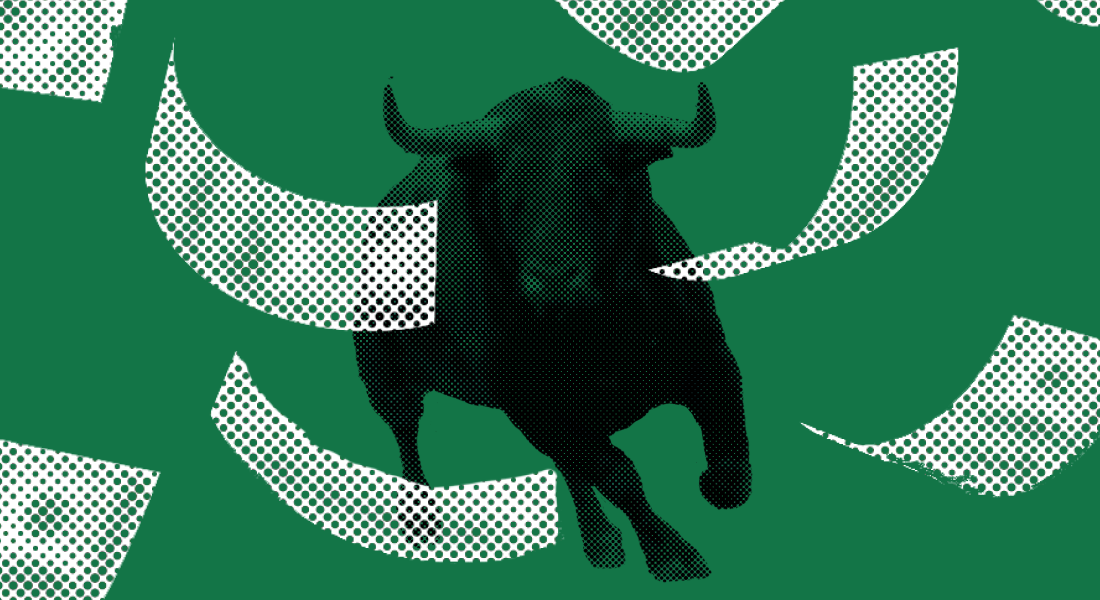
Category-Driven Visual LogicI designed a library of templates where the visual "DNA" shifts based on the content category, allowing readers to visually identify the topic before reading the headline.
The system was built to be "future-proof," allowing the marketing team to swap backgrounds and headlines within a fixed grid system. This ensures that whether the post is about "Spain Payroll" or "CEO Misconceptions," the RemoFirst brand remains unmistakable.


Have a project in mind? Let's discuss how we can bring your vision to life.
